Introduction
I am constantly working to get something done and then it's on to the next thing. In this cycle, I don't ever take the time to put what I have created into the world for people to see. To break this habit of not sharing, I committed to posting a design or something I was currently working on each day for thirty one days straight. I strongly believe being immersed in all aspects of design from user interface and user experience to t-shirts and branding makes me better at UI/UX and being a Creative Director at Phase 2. In almost every design there is a problem to solve, a tool to become more proficient in using, or a new technique to learn. Some of the designs I posted were work-related, and others were from my free time outside of work. In this blog, I am sharing some of the posts related to what I do on a day-to-day basis at Phase 2. Enjoy the designs!
Hot Hunks T-Shirt Design
Phase 2 recently got the entire company memberships to the new Lifetime fitness center in Oklahoma. I took the opportunity to design us a fun shirt we could wear to the gym. I created a Merch by Amazon account a while back so I could easily get designs like this to a couple of friends and it ended up coming in handy for this too. Learn more about Merch by Amazon in the helpful links.
Tools Used
- Adobe Illustrator
- Amazon Merch
Wind Compass Background Personalization
Wind Compass is an IOS and Android weather app that Colbey (Phase 2 Developer) and I made outside of work to get extra practice in our craft. One of the unique features in Wind Compass is the ability for the user to select their background color. This animation shows how the UI works with all the different background colors.
Tools Used
- Flinto
- Sketch
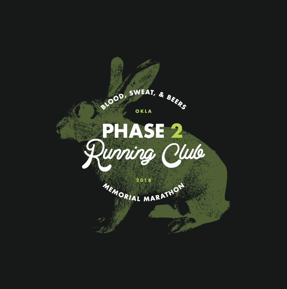
Phase 2 Running Club Graphic
Phase 2 has a lot of runners on the team. We are also a sponsor and have yearly participants in the Oklahoma City Memorial Marathon. We have been involved with the marathon since 2010 when we developed the first memorial marathon athlete tracking app. Last year we spun up a running club to get in shape for that event. I thought we could use a good looking training shirt.
Tools Used
- Adobe Illustrator
- Adobe Photoshop
Drakewell Website Redesign
Drakewell, an oil and gas software company spun off from Phase 2, is constantly pushing out new features. Our design team recently redesigned the website to showcase the new features and product offerings. This design change was important to showcase what Drakewell offers to both existing clients and potential clients.
Tools Used
- Sketch
- Abstract (Version Control for Designs)
- Website Stuff (HAML, SASS, Javascript, Middleman)
Banking App Prototype
This is a recording of a clickable prototype we did for a prospective client at Phase 2. Prototypes like this are created to make sure we are on the right track before development starts. This is just one aspect of the design-first approach that Phase 2 uses in software development.
Tools Used
- Adobe XD
Our 20 Year Anniversary Branding
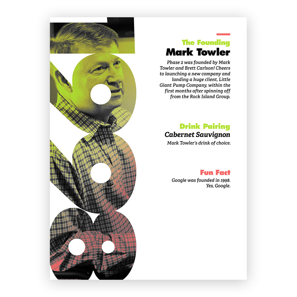
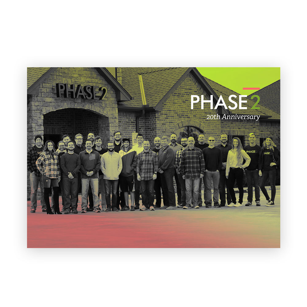
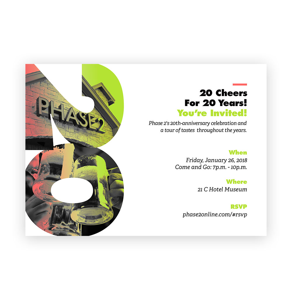
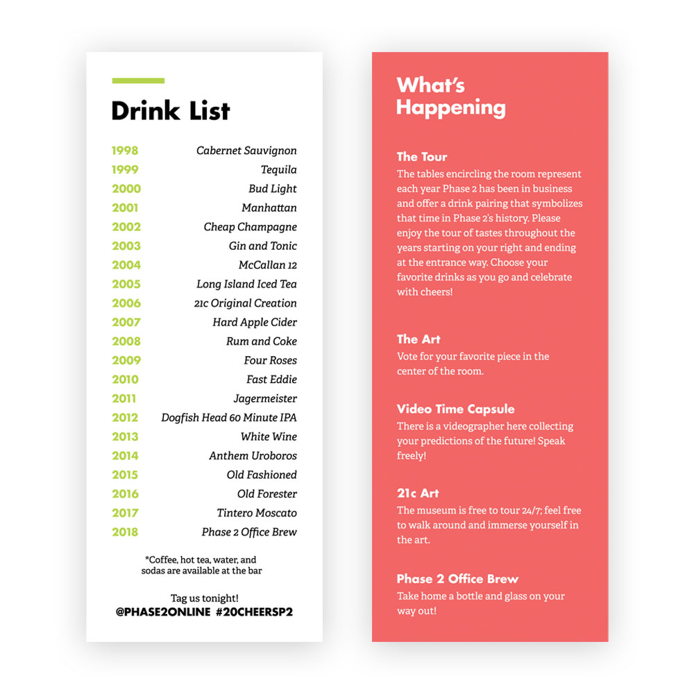
Phase 2 has been in buisness for over 20 years! To celebrate earlier this year we had a 20 year anniversary party with clients and friends of the company. Here is some of the branding we put together for the party.
Tools Used
- Adobe Photoshop
- Adobe Illustrator
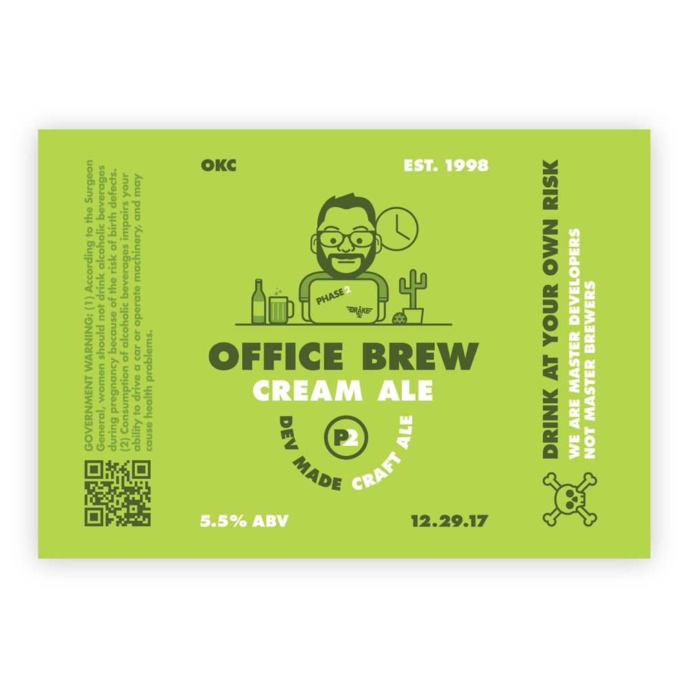
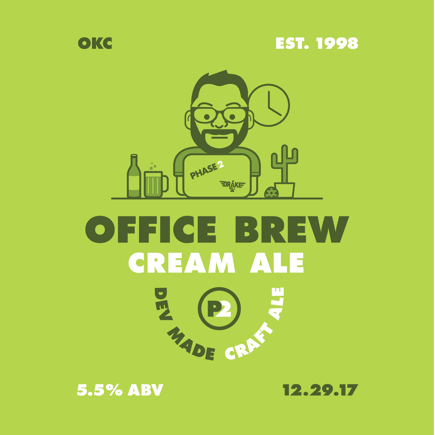
Phase 2 Office Brew
For the 20th-anniversary party some of the team brewed a beer for our guests. I had the privilege to design the label for it.
Tools Used
- Adobe Illustrator
Helpful Links
Phase 2 Brew VideoPhase 2 Case Studies
We recently redesigned our case studies for the website to help clients better understand Phase 2's capabilities. These are live on our site now so be sure to go check them out.
Tools Used
- Sketch
- Abstract
- Website Stuff (HAML, SASS, Javascript, Middleman)
WindCompass Wind Pattern Background
This is another example of a unique background in windcompass. This background is a visual of live wind patterns. This was a prototype that was made in after effects to make sure the new interface could accomodate this particular background.
Tools Used
- Sketch
- Adobe After Effects
Drakewell 404 Screen
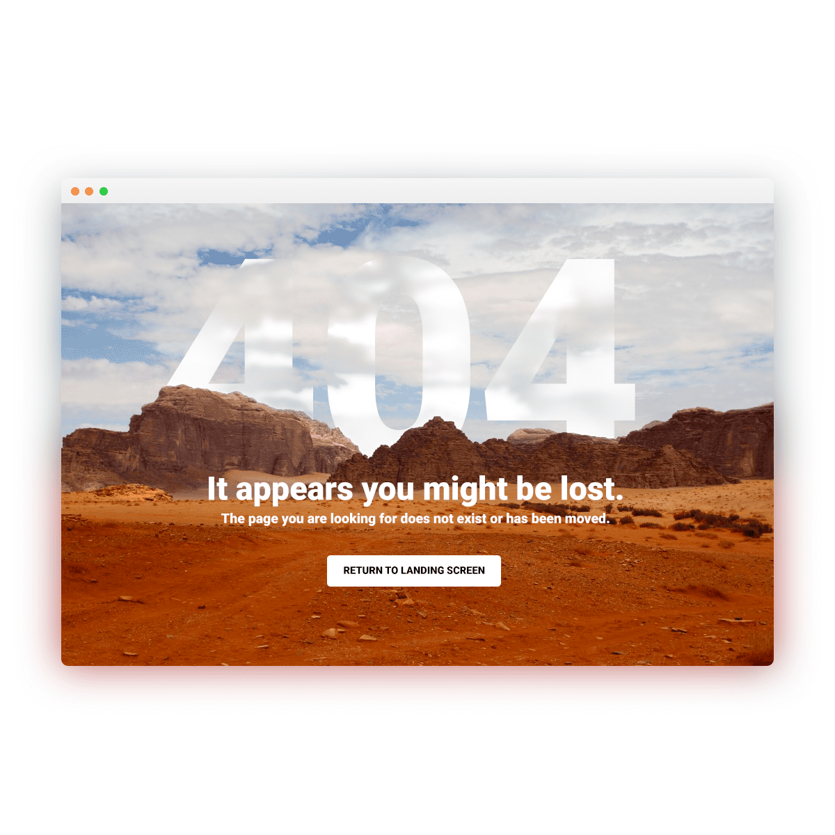
Hopefully, if you use Drakewell you will never have to see this, but I think it looks really nice so here is your chance to take a look. The smallest details of an application can make a huge impact on the user.
Tools Used
- Adobe Photoshop
Helpful Links
Drakewell WebsiteDrakewell Responsive Login
One of the major components for Drakewell's success is its ability to function on all devices. Our users access Drakewell on the go and in the office, so we make sure it looks good wherever they are. On the left is the Drakewell login screen and a great example of the attention given to responsive layouts.
Helpful Links
Drakewell WebsiteFull WindCompass Protoype
A majority of the posts are Windcompass related. This is because I use it as a playground to stay up to date on design trends and learn new skills. This is a prototype made in Flinto that showcases the majority of the app and transitions between screens. Making prototypes with this much detail helps the development of the app progress quicker and enables you to address problems early on that you might run into later.
Tools Used
- Sketch
- Flinto
Screen Transition Prototype
Interactive prototypes like this that include screen transitions and animations are helpful for many reasons. It communicates our end goal for the application clearly to clients. It is easy to adjust before real development starts. It also gets rid of any misunderstanding of how the application should behave when the designs switch to being implemented.
Tools Used
- Sketch
- Flinto
Drakewell Realtime Initial Mockup
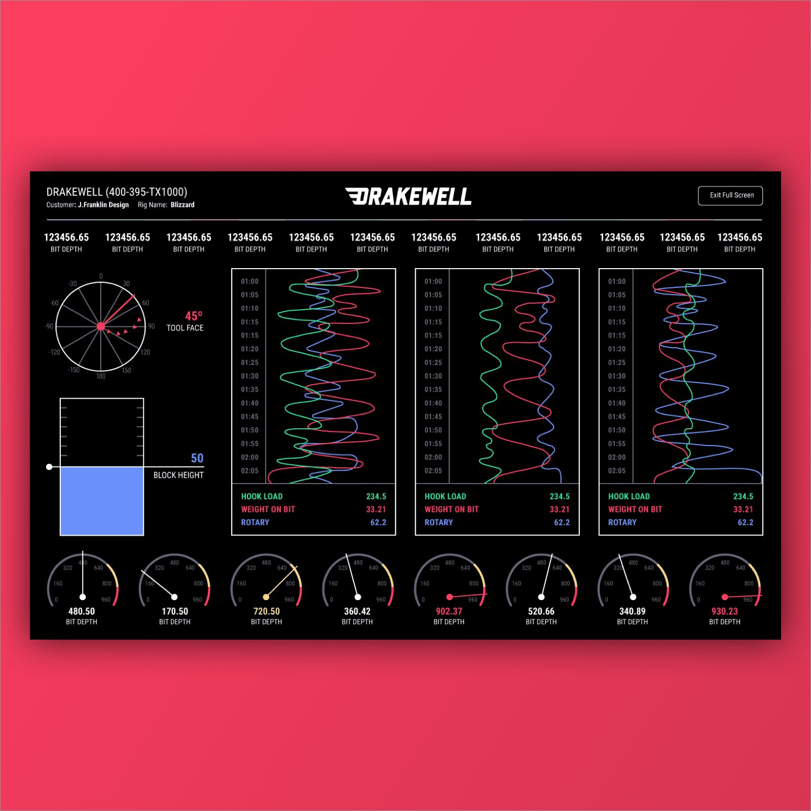
Drakewell Realtime dashboard is a set of sensor data collections for remote real-time operations. It allows the surface data feed to be viewed in real time from any remote location, like a Remote Operations Center, or from any mobile device.
Tools Used
- Adobe Illustrator
Closing Thoughts
If you made it this far, thank you. If you want to see all of the design posts and more take a look at my Instagram. Also, if there is anything you saw above about tools or techniques that you would like for me to go into more detail about, please let me know. I'll happily do an in-depth blog post about that technique. My email is jojof@phase2online.com , and I hope to hear from you soon.

